Help your users by having a consistent UI
I was filling a form the other day and I found myself in the position of a user of an "interface". It was a paper form, though. But the concept of a paper user interface is similar to a softare UI.
This was the form:
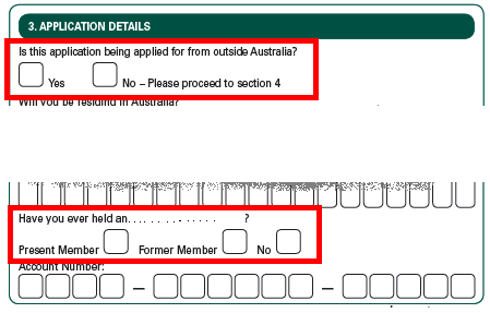
When I answer the first question as "No" my brain learns and stores the information that if I want to answer question I have to check the box on the left hand side of the label. Therefore:

Then, suddenly I get to the next question and I want to answer No again... And... This is what happens:
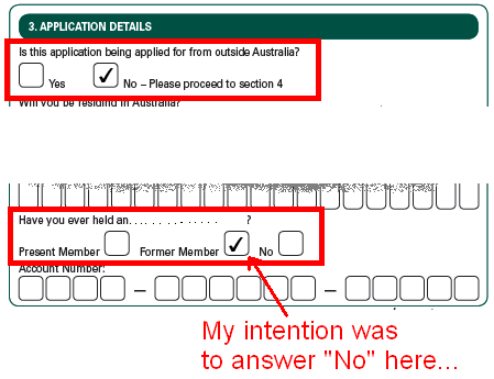
The interface changed. For this question, the box is in the right hand side of the label... I ended up answering it wrong.
In summary, interfaces need to be consistent.